
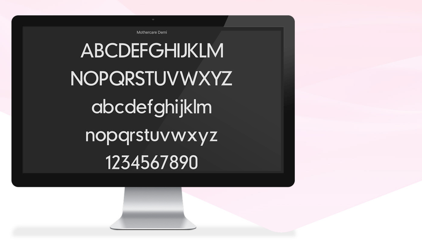
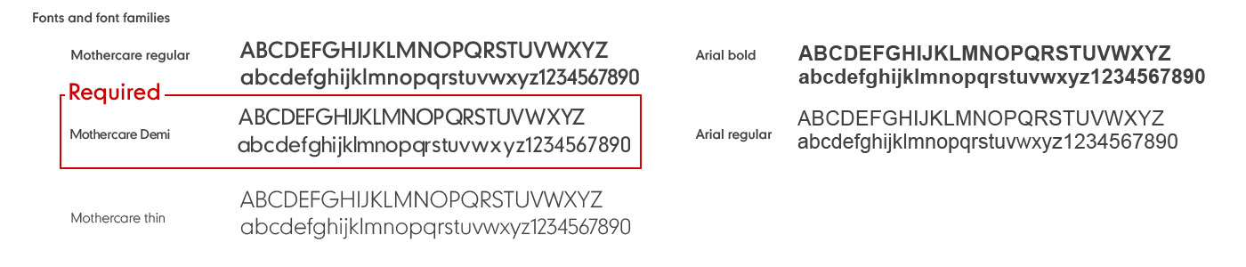
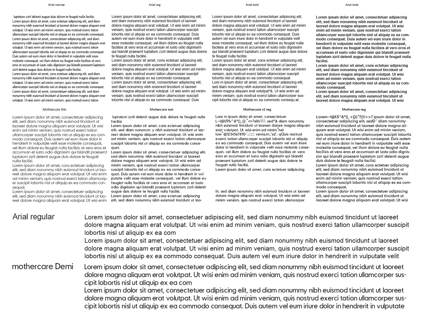
mothercare had a bespoke branded font family which comprised of two fonts 'mothercare regular' and 'mothercare thin'. The fonts worked well for store and promo POS application, but were not suitable for digital devices (excluding banner design). As a result Arial regular and Arial bold had been substituted.
The mothercare thin font failed accessibility below 16pt, this restricted its usage for UI purposes especially on mobile devices. Mothercare regular resembled a semi bold weight, making it difficult for body copy and required HTML to further strengthen it when required.
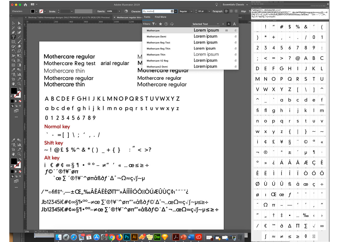
Example of a working file consisting of vector characters used to make the additional mothercare font. Showing various test designs (drop down)
The ability to mimic Arial regular was paramount allowing for a smooth replacement solution and reduce regression impact across the site.
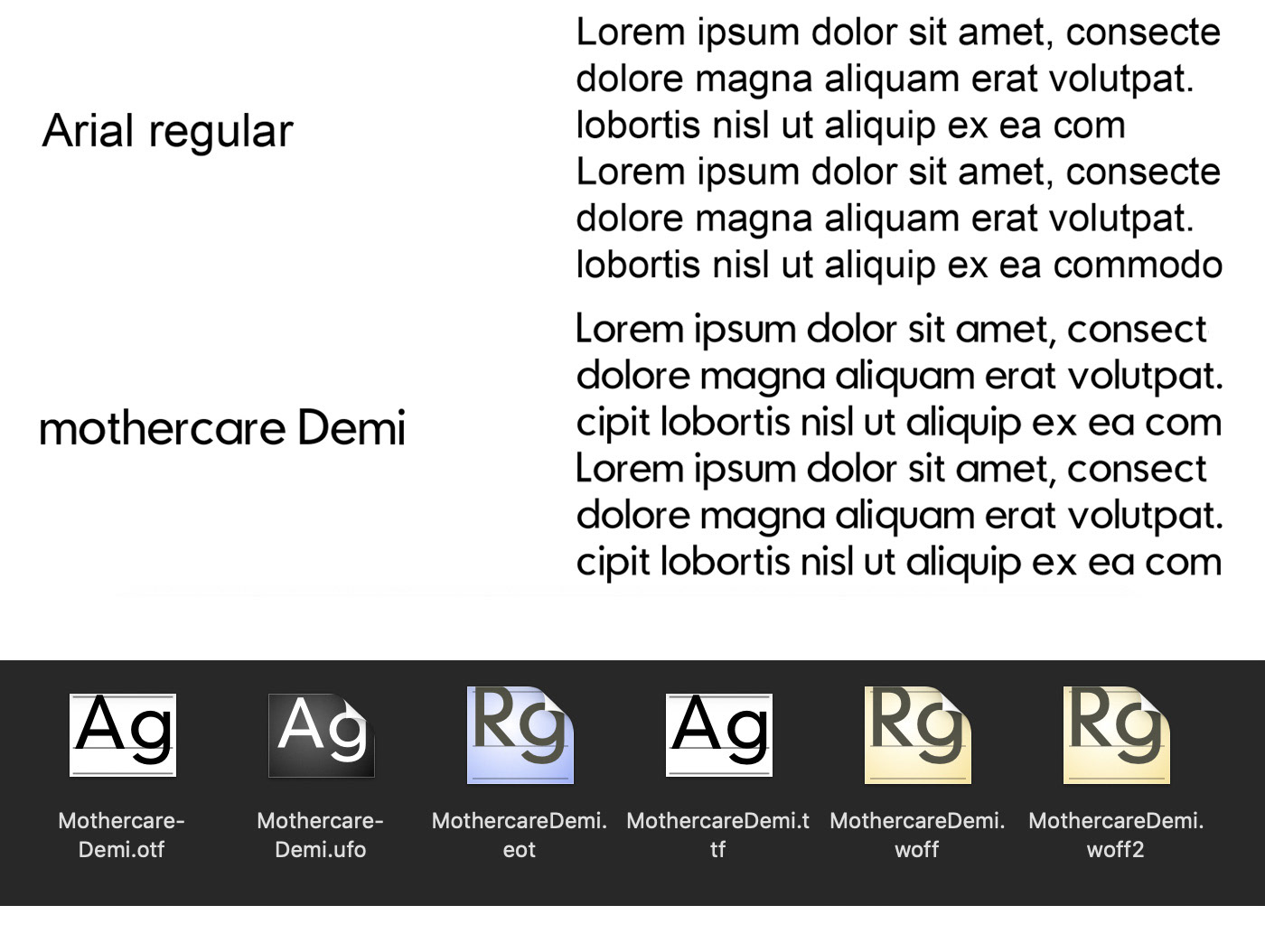
Once the font was fully created (all characters) and kerning adjusted using Glyphs the font was saved into distribution formats ready for use.
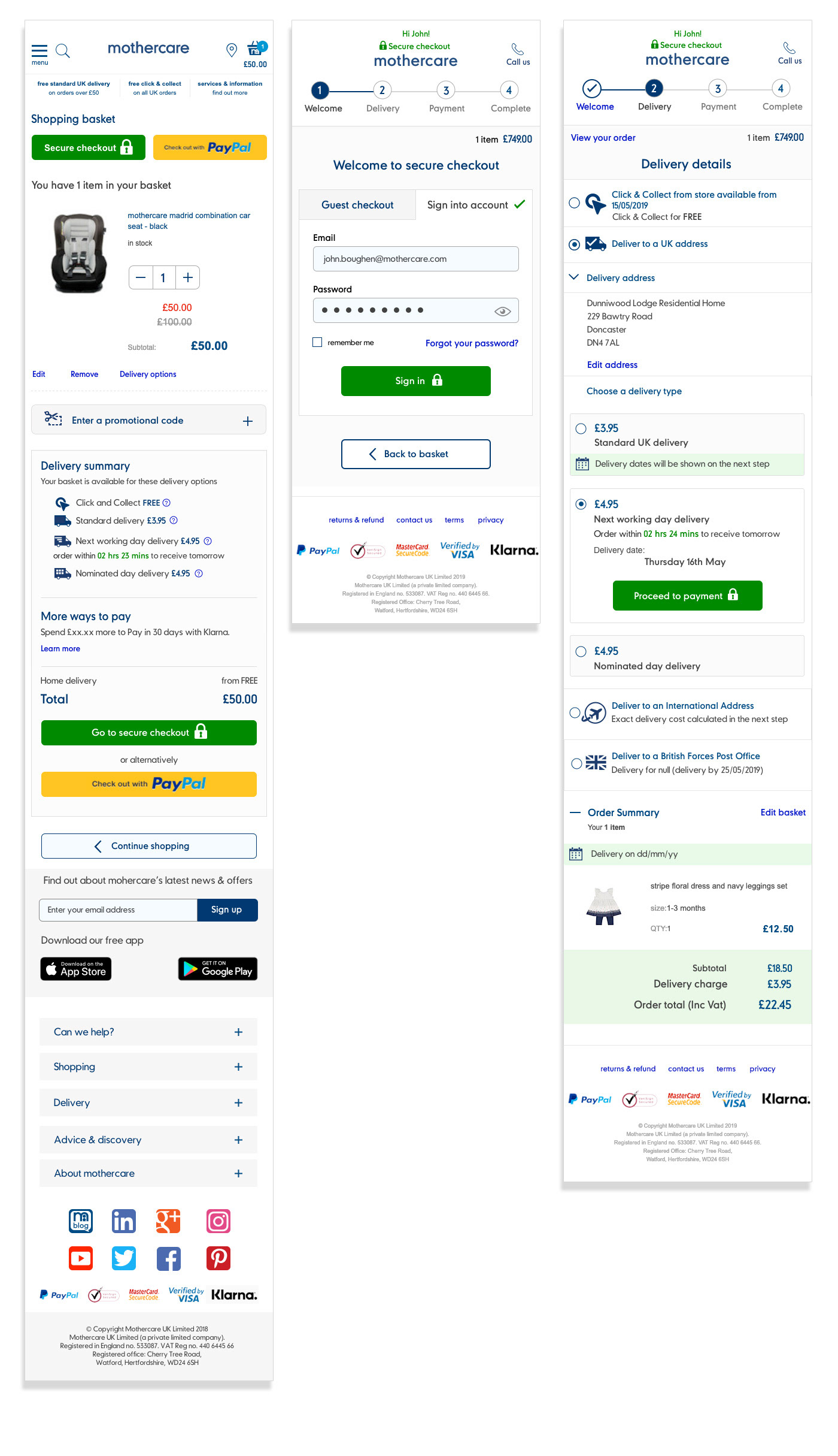
Some mobile page examples showing the new font intergration allowing for the removal of Arial Bold and regular usage.