
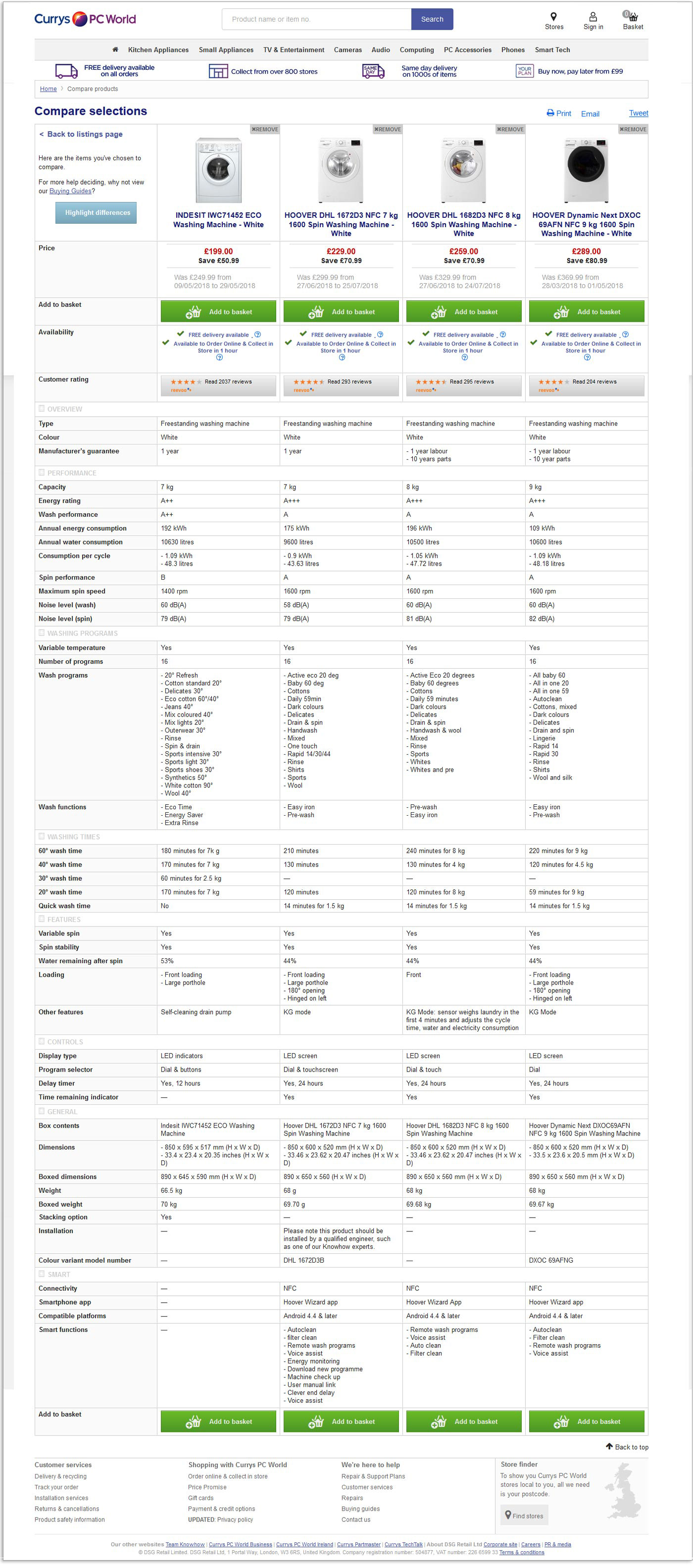
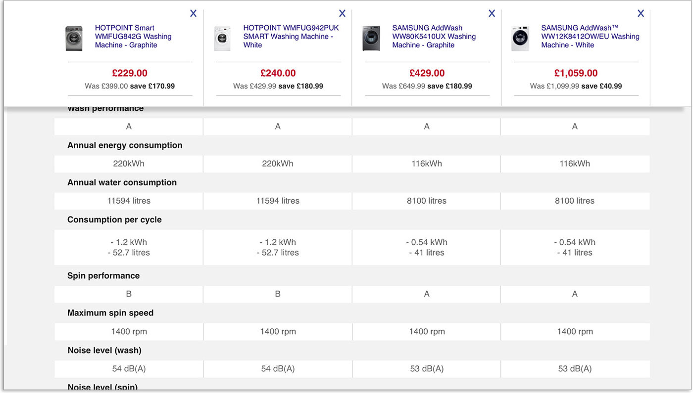
The initial comparison page below, users found the information difficult to read or navigate by sheer volume presented and visual layout. When asked if the specification data should be reduced all users declined and saw merit in the information provided. A better visual execution was required.
Final version of the comparison landing page, default view (with overview and general accordion sections open) allowing for easier search criteria.
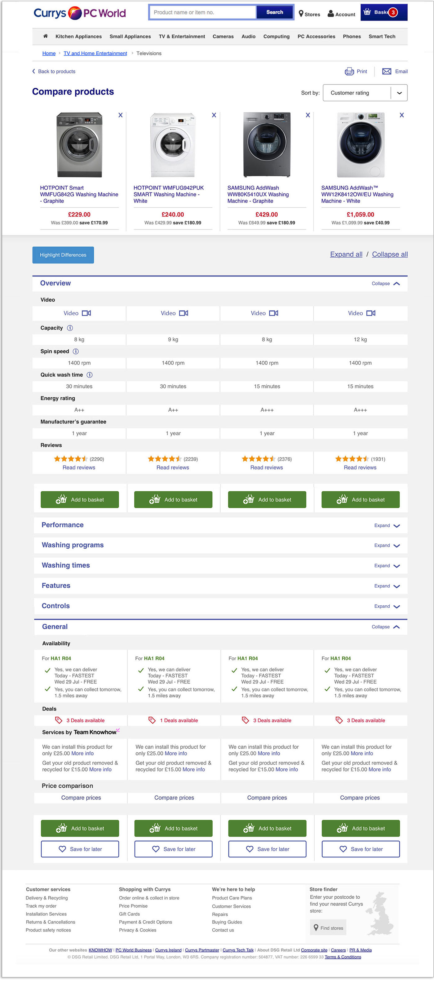
Floating (sticky) bar, product title linking to product page, users have the ability to change the order of the products by using the 'Sort by' drop down at the top of the page, mirrors the functionality of the segment page.
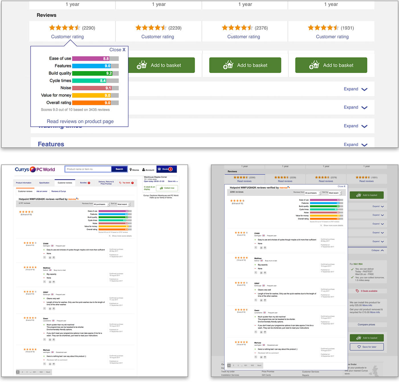
Finalised version for displaying customer product ratings (independent reviews) Users preferred the simplistic graphical design capturing key product features. With ability to read full reviews on specific product page.
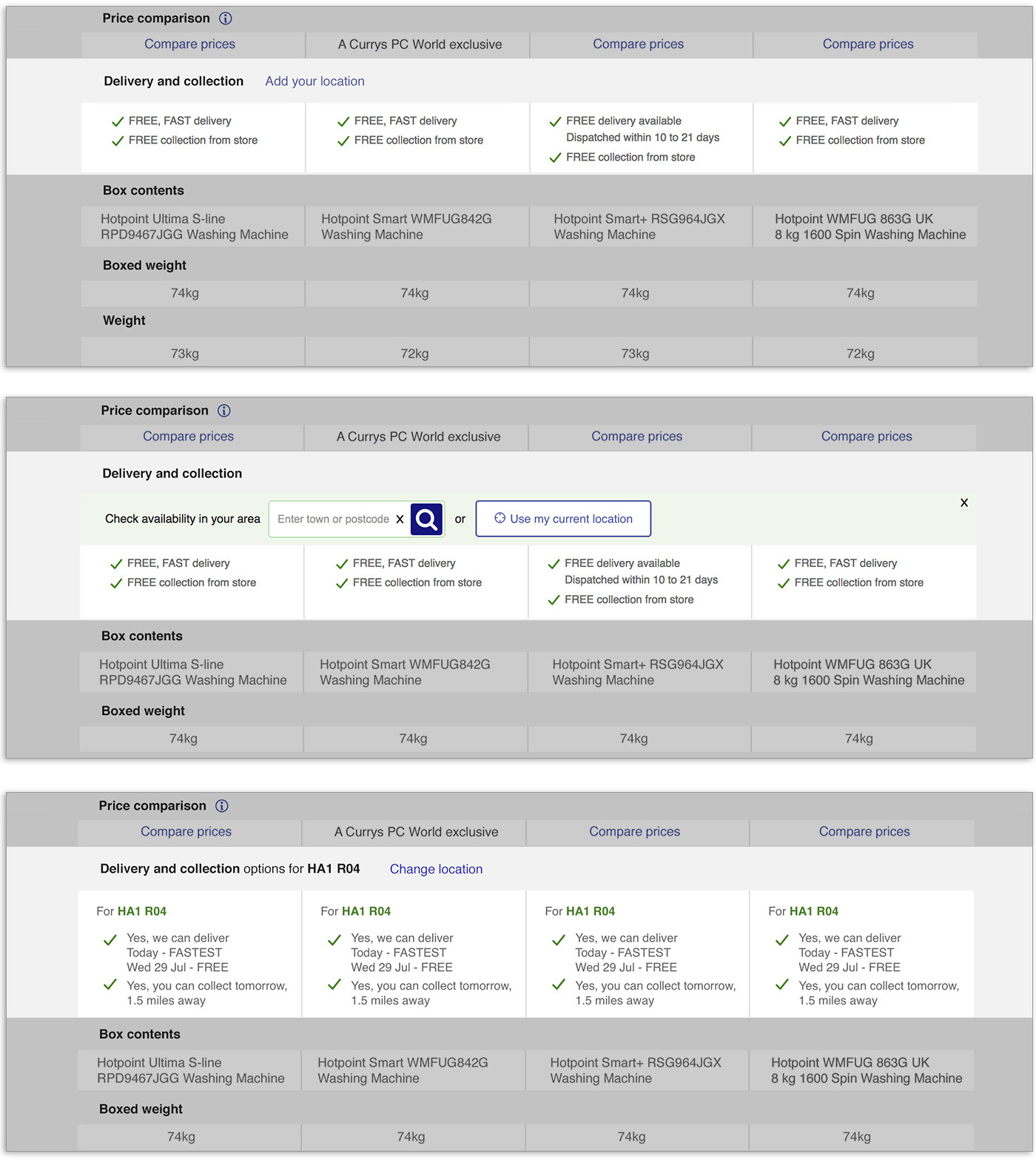
Comparison product postcode checker functionality, initial component dependent on segment page interaction.
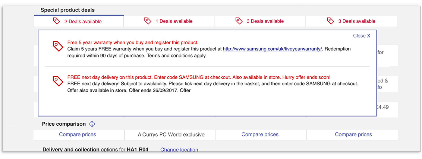
Functionality to show each of the product deals in more detail, existing content pulled from the product page.
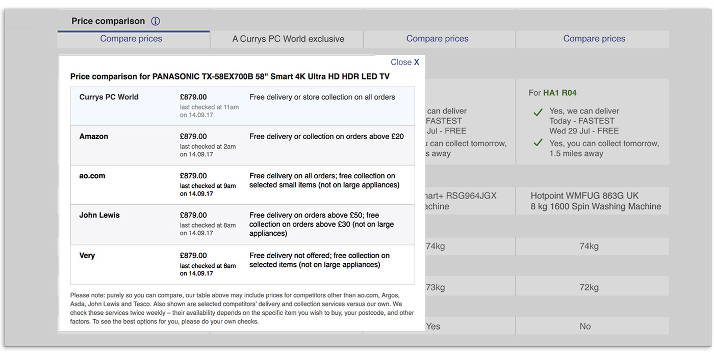
The ability to use a 'Price comparison' tool for each product, unless an exclusive model.