

Insight
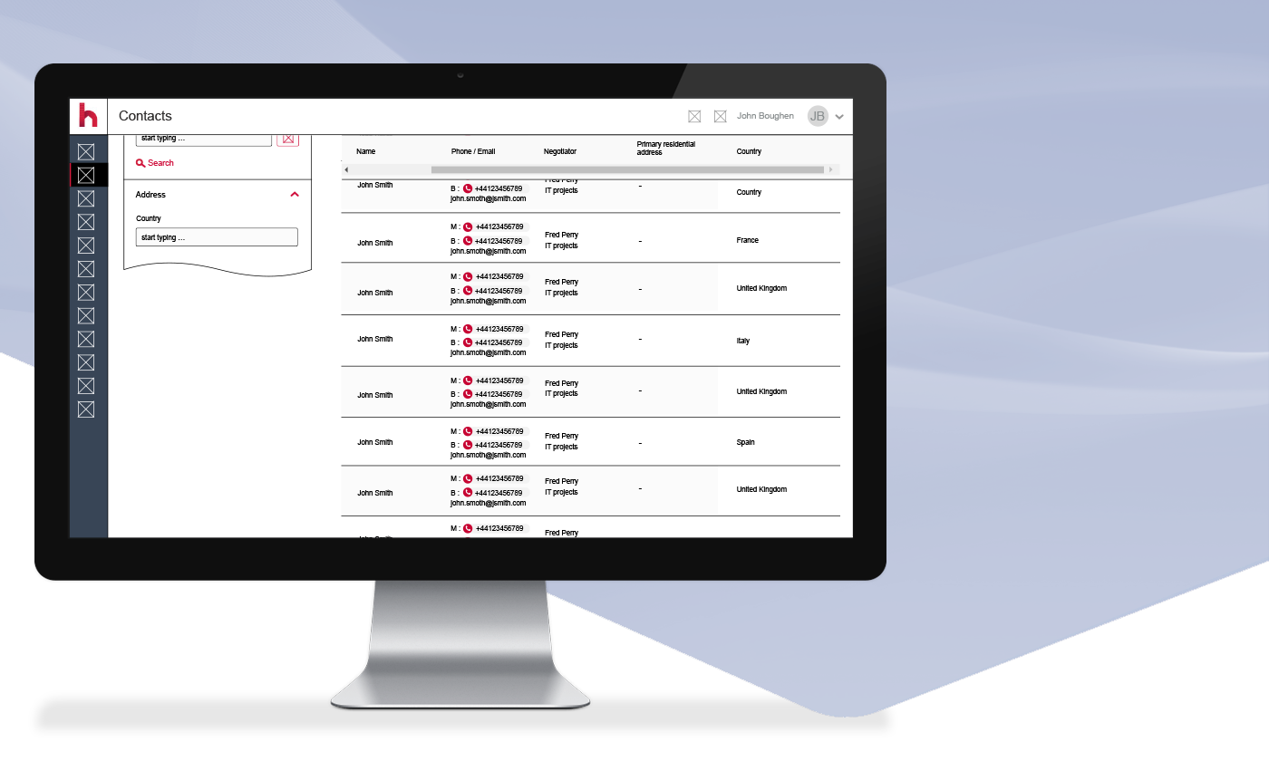
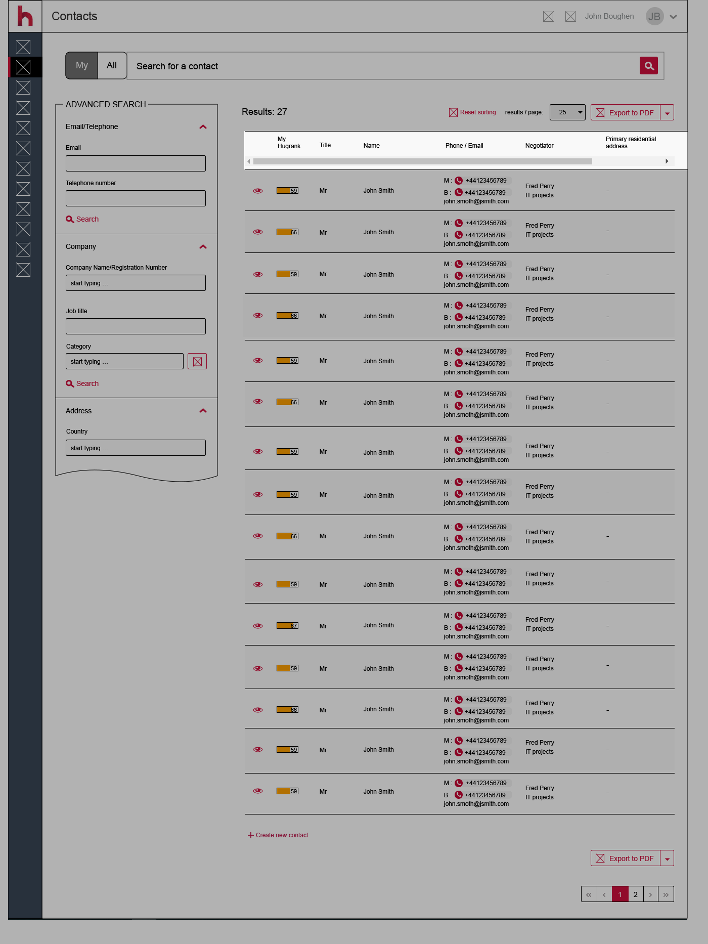
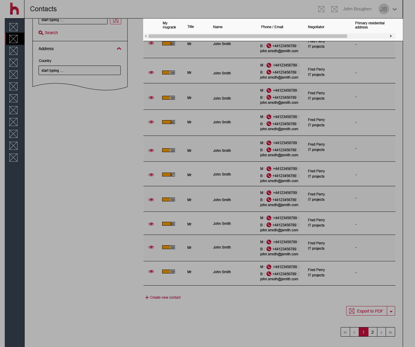
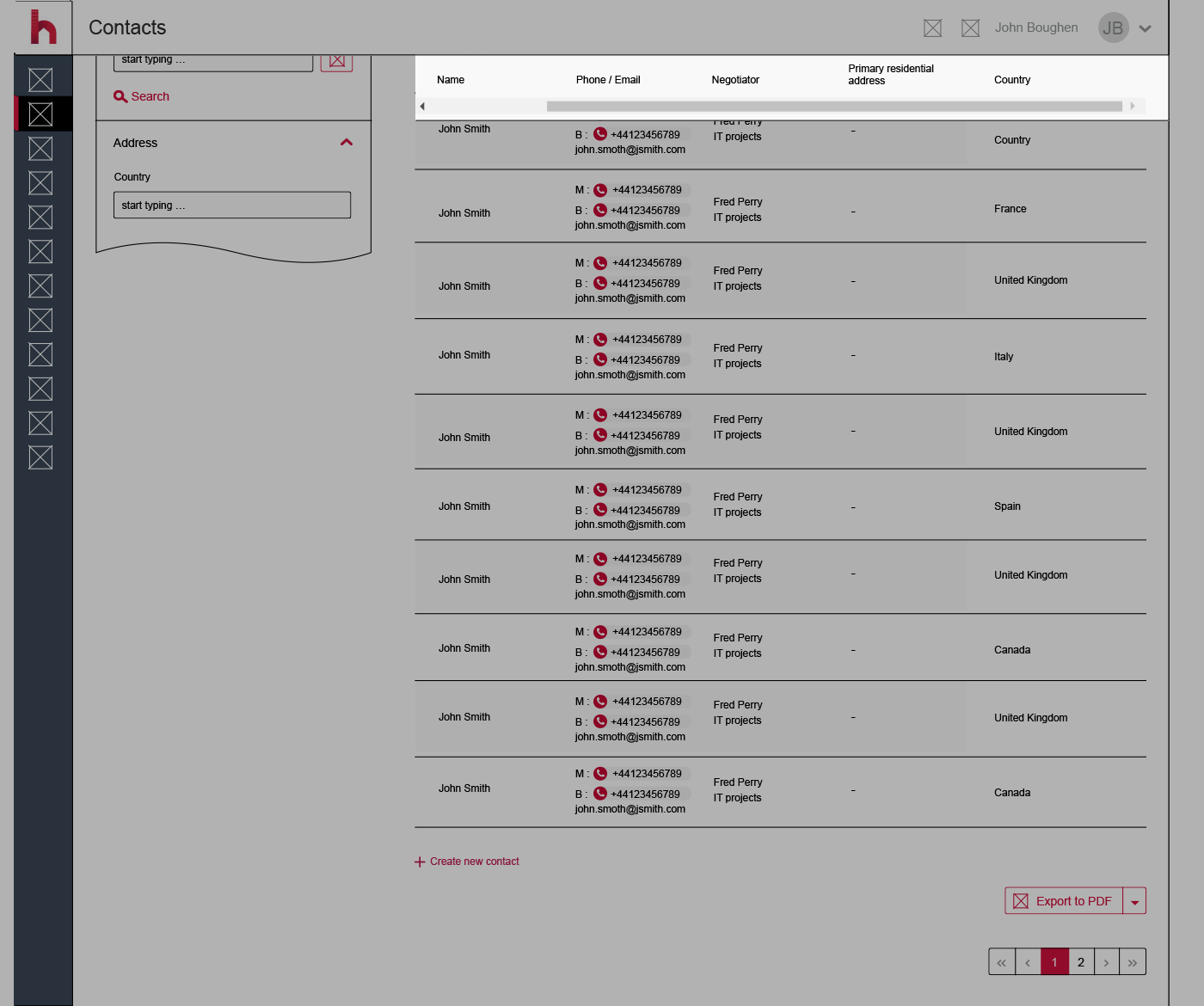
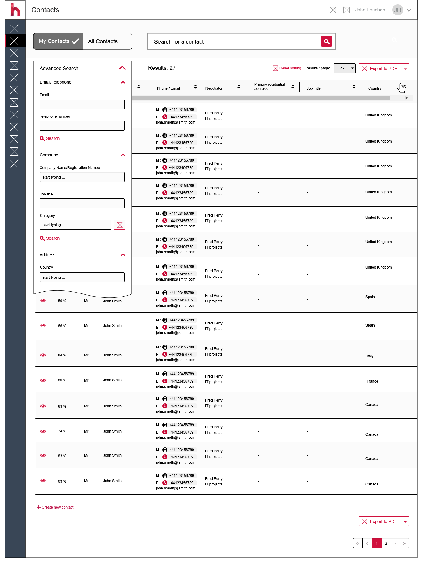
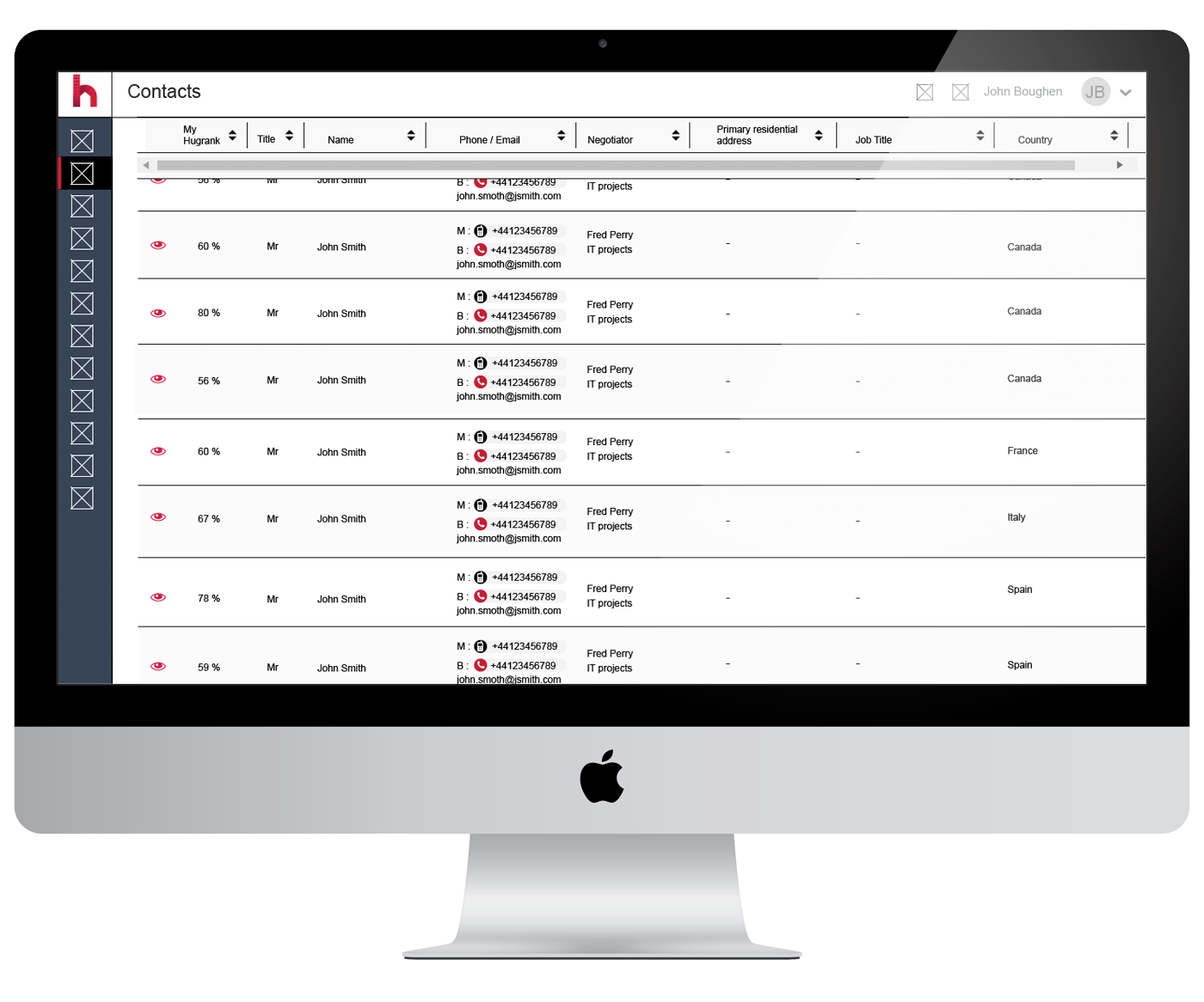
The issue is the data set is too large for monitors, (desktop) the table has a scrollable area but to see that scroll bar you need to first scroll down the whole page, then you can scroll horizontally.
But now you can’t see the column headers. See image below for visual refefence. A proposed solution is required for the issue of viewing the data for the contacts without having to scroll back up to see the header titles / context.
UX goals
To allow the user the functionality to both add multiple search variables for contacts (advanced search) and be able to easily navigate and understand the data sets presented.
Also, to evaluate the page holistically and offer improved functionality to allow users to carry out tasks with greater ease.
Current issue showing scroll bar functionality at the bottom of the results table. (screenshot)
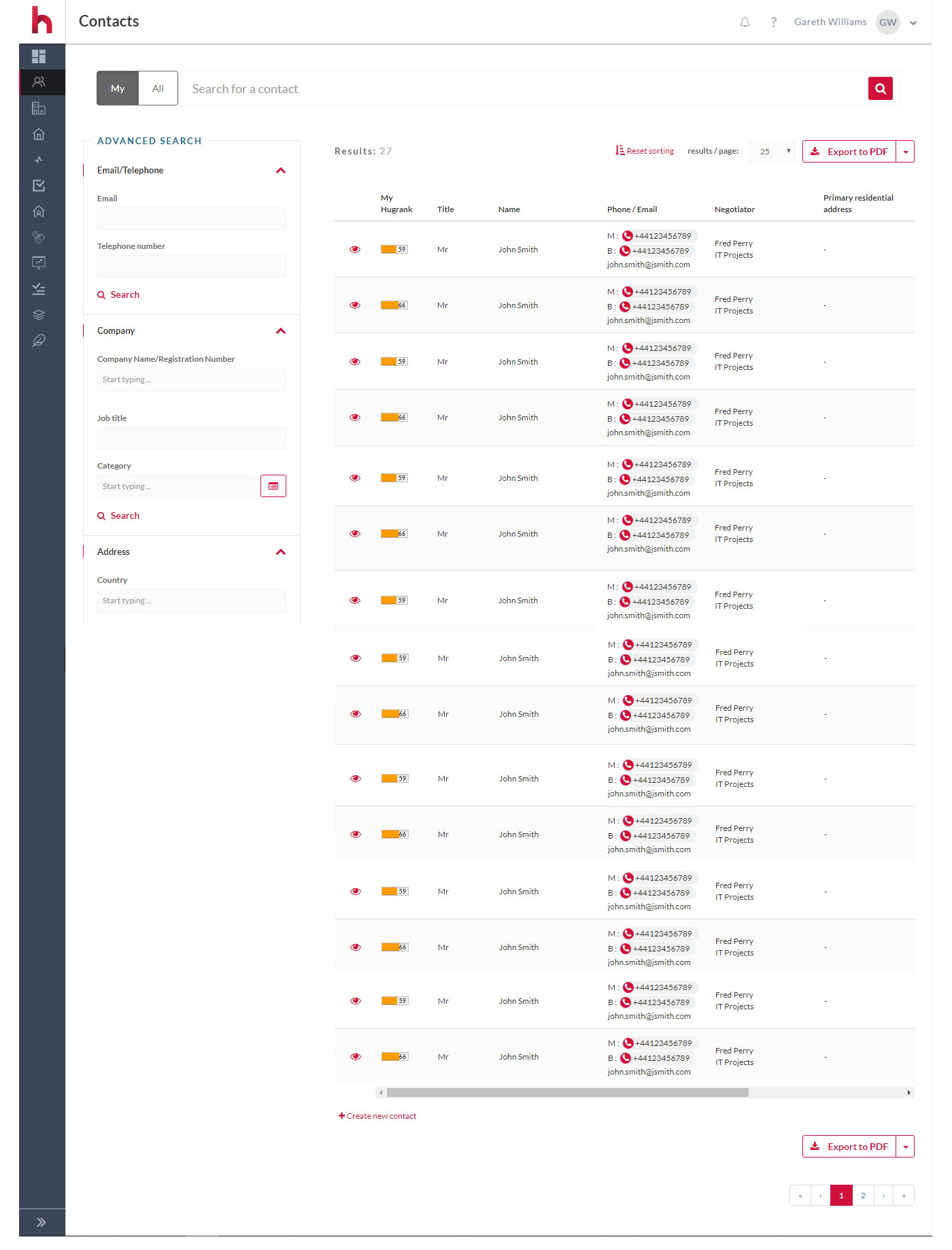
Quick page evaluation
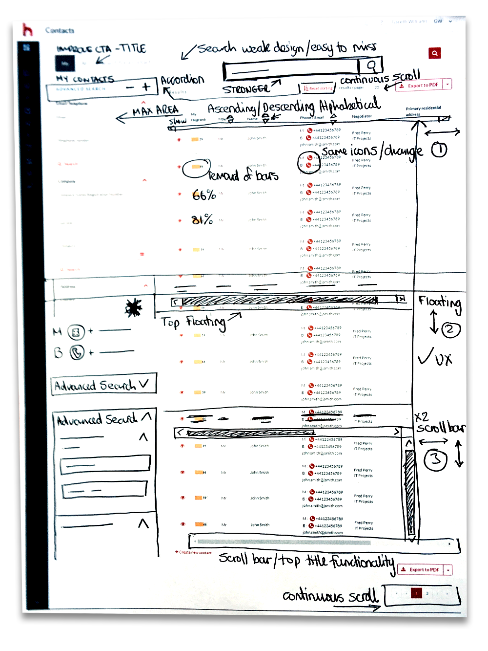
Initial ideas looking at the entire page, noting issues and solutions.
When working with existing functionality its useful to scribble concepts/thoughts on a screenshot printout.
I find it useful and productive to capture ideas and thoughts prior to producing low fidelity wires.
3 concept variants to explore, from initial ideas.
Low fidelity concept sketches
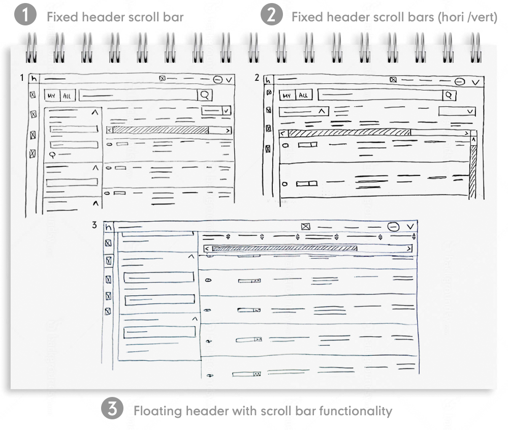
Floating scroll bar header wire frames
Scroll bar functionality placed at the top of the search filter category title bar
Floating scroll bar search category filter title component (left scroll aligned)
Floating scroll bar search category filter title component (right scroll aligned)
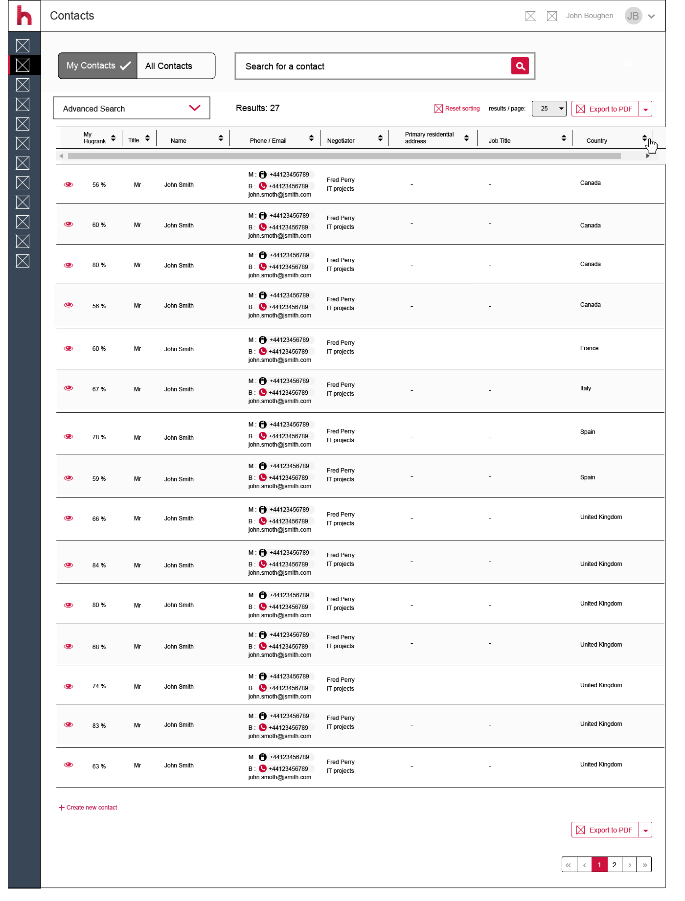
Holisitc functionality recommendations
Further page improvements to support the initial problem (illustrated within wire frame below)
1. Improved CTA for my / all contacts - more intuitive
2. Improved visability of the search bar
3. Advanced search accordion allowing full width of contact data table
4. Ability to individually ascend / descend via alphabetical order search sorting results
5. Visual difference between telephone and mobile iconography
6. Removal of percentage bar for My Hugrank, allowing easier reading
Another option to consider - continuous scroll allowing the removal of pagination and results/page functionality. It has more potential to engage users. (Scrolling minimises the interaction cost required to attain a variety of user goals. The advantage of not having to click “next” keeps users engaged with the content and less focused on the mechanics of navigating to the next page.)
Advanced search accordion component closed (default) Country filter showing ascending alphabetical order wire frame
Advanced search accordion component open. Country filter showing descending alphabetical order wire frame
Full width floating scroll bar header (advanced search accordion closed)
Conclusion
There are many options to adopt for prototype - user testing in order to improve the page goals and user experience. I have only highlighted a few flaws; with testing and further behaviour insight more challenges could be presented. Obviously, business needs, resource, time and roadmap commitments play critical factors when defining a solution.